UX Project

[BREWERY MENUS]

Product Overview

Product Overview

Product Overview

An assortment of screenshots of beer menu app

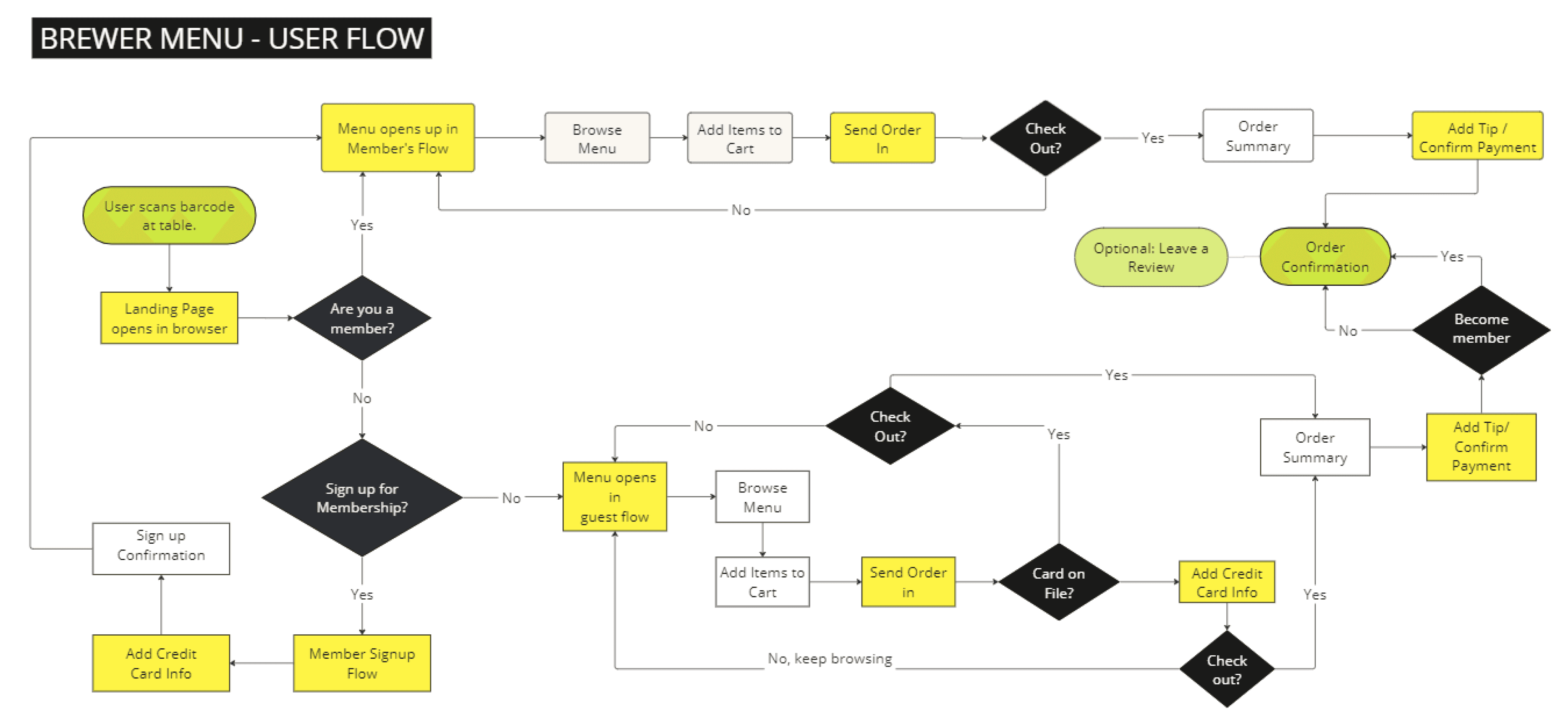
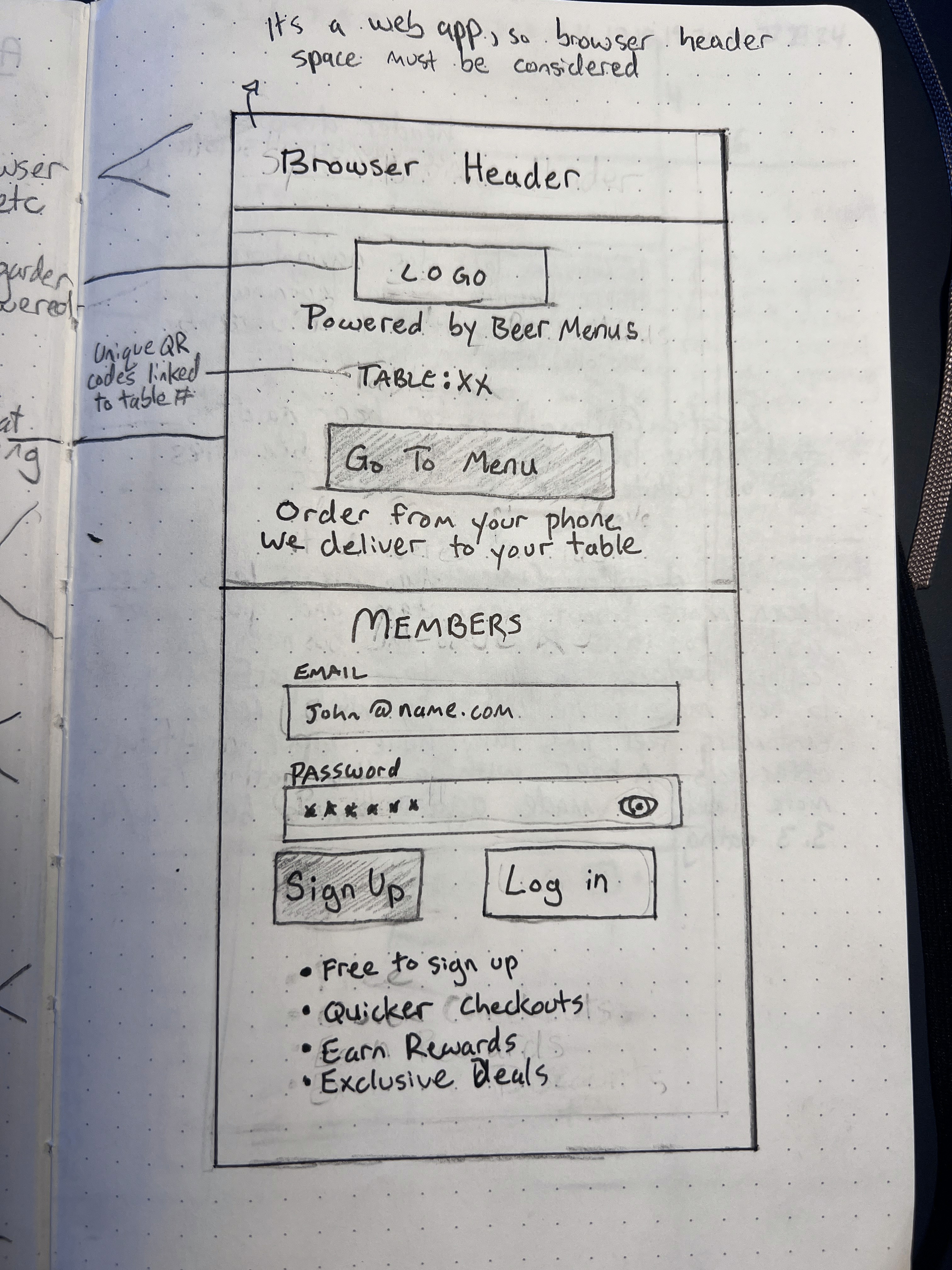
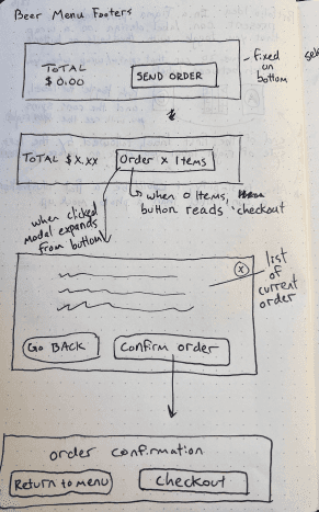
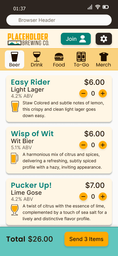
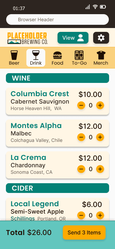
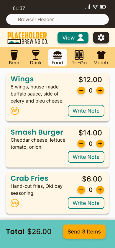
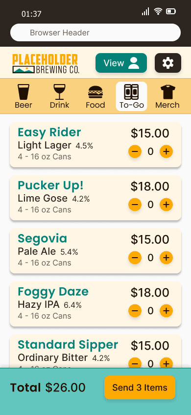
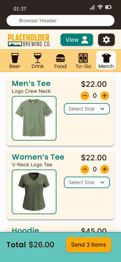
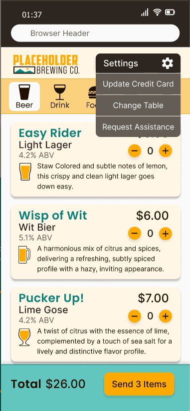
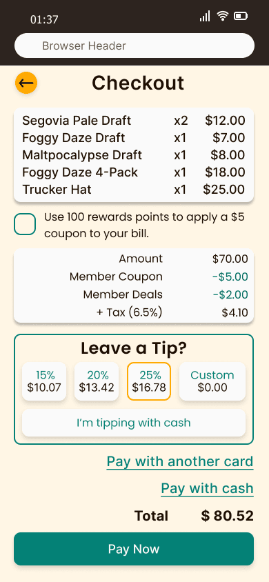
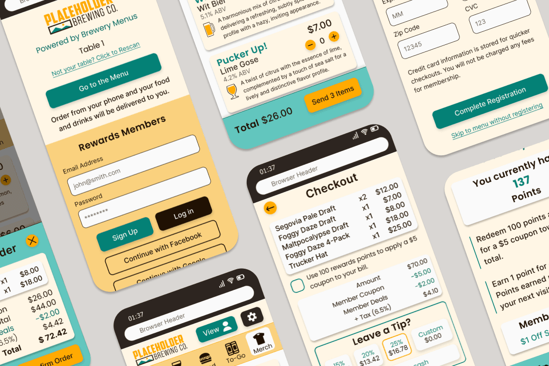
Brewery Menus is a customer operated Point of Sale (POS) web app that combines the ease of table service with the convenience of on-demand ordering.

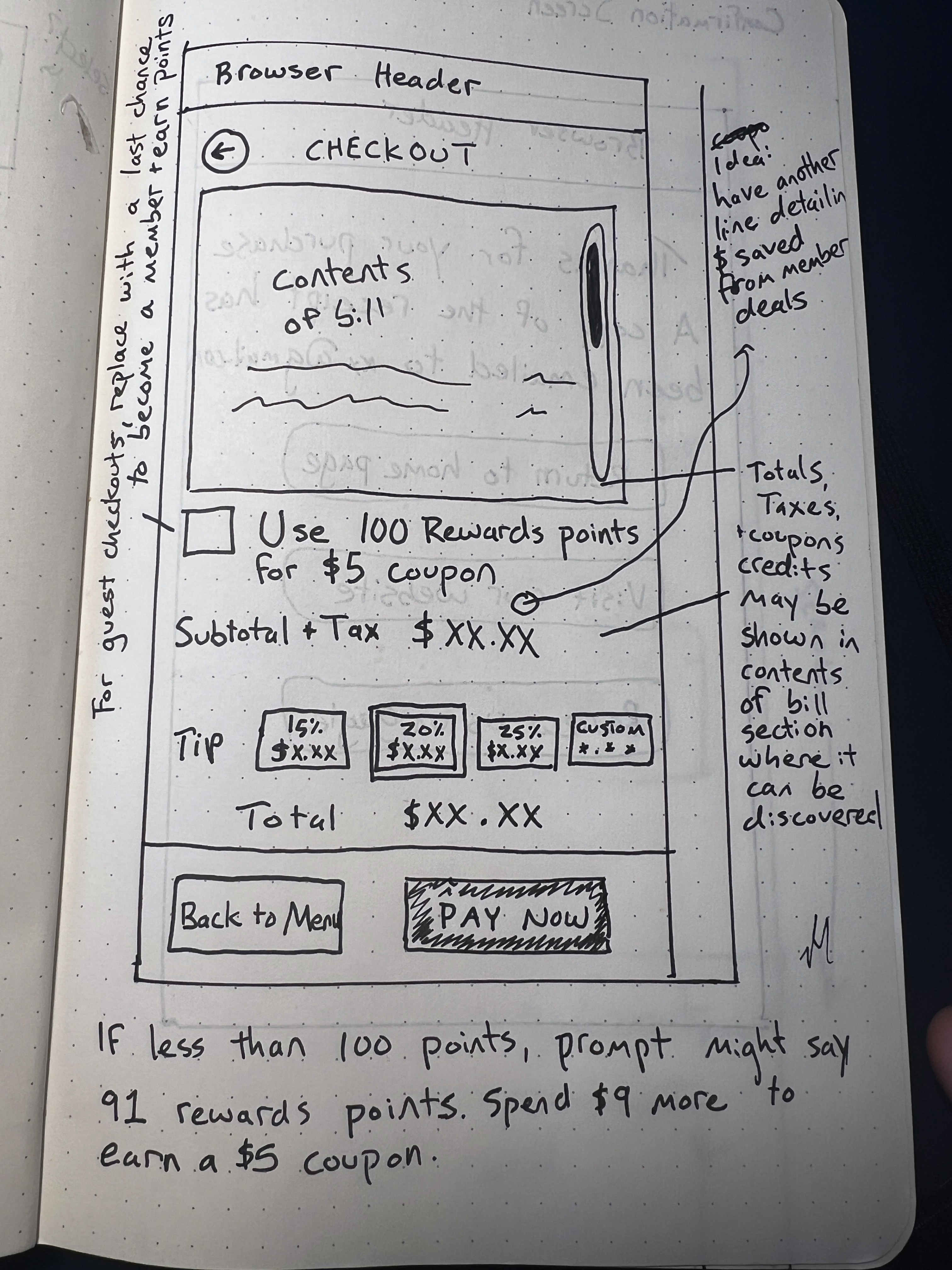
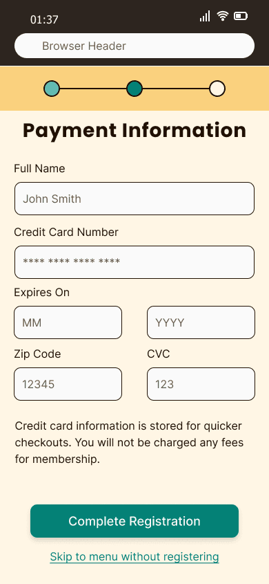
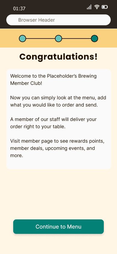
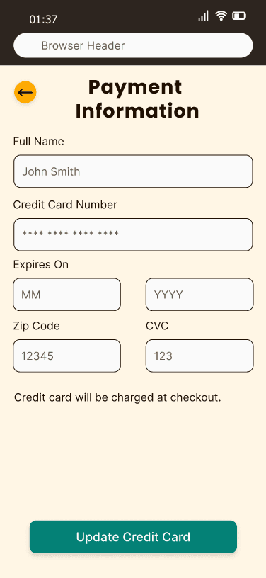
The concept is simple. Scan a QR code at your table, and start looking at the menu. The app is designed to be convenient for first time users while servicing repeat users with fast checkouts and exclusive discounts and coupons.

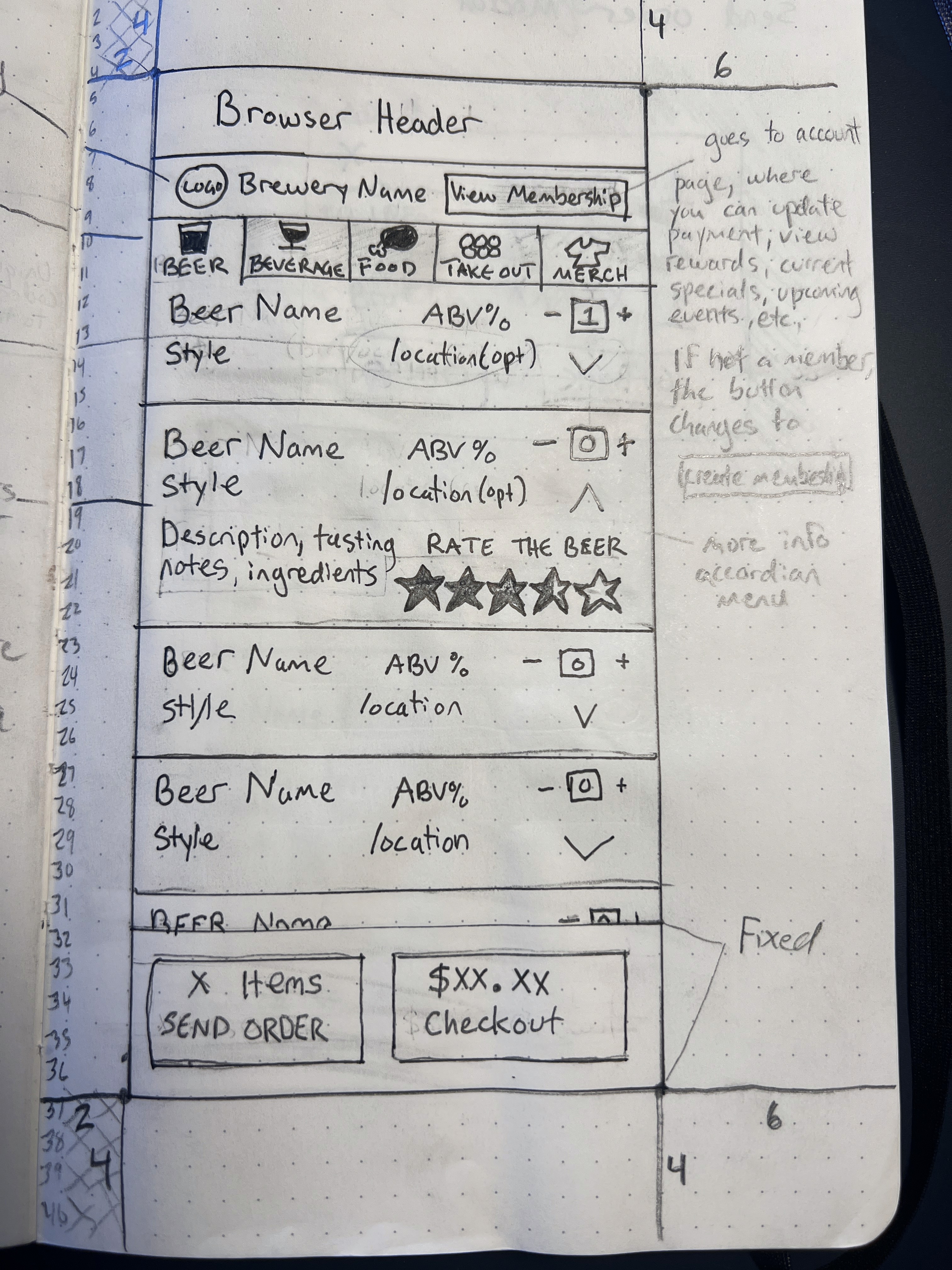
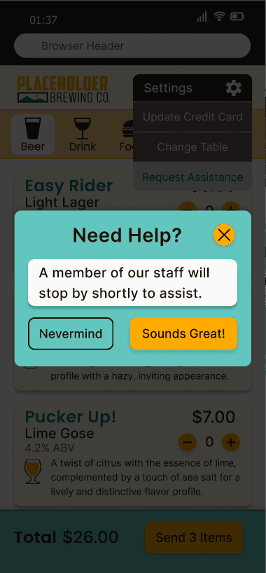
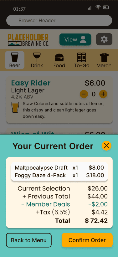
Brewery Menus emulates a typical brewery experience. Build custom flights, fill growlers, buy merchandise, and even request help from a staff member! Everything is built for customer convenience, and for the convenience of the staff to be where they need to be, when they need to be.

Problem

Problem

Problem

There are two distinct problems. Brewery Menus aims to address both.

The first is in the typical brewery experience. The user will walk up to the bar to place an order and carry it back to their table. This is can be inconvenient on its own because the user has to get up and interrupt any conversations or activities they may be engaged in. It can be further inconvenienced if the bartender is busy, forcing them to wait in a line.

The second problem is with mobile ordering. Users have experienced frustration using mobile menus in the past: it takes too long to browse and the checkout process is cumbersome. Many users prefer looking at a paper menu and ordering from a knowledgeable staff member. Some tasks in breweries like getting a flight of beers or filling a growler are not well represented in mobile menus. Entering a credit card on each visit is a hassle. And there are no perks to using it!

User Flow

User Flow

User Flow

Flow Chart showing possible paths a user takes navigating the brewery app.

The user flow above diagrams the primary tasks completed by a user on a typical visit. The flow separates users into 2 groups, members and guests.

A guest may look at the menu first without the hassle of entering any credit card information until they actually order something. Guests will also have the opportunity to become members at checkout to receive member benefits.

One thing to note: the user flow becomes more streamlined after a user becomes a member.

Sketches

A selection of hand-drawn low fidelity prototypes:

Wireframes

The selection of medium fidelity wireframes.

While much of the design in the initial prototypes are in the current high fidelity prototypes, many of the initial ideas were altered after testing. For example, the wireframes have 2 CTA (Call to Action) buttons when ordering. In the high fidelity prototype, this was condensed into a single CTA button.

Design System

The design system is simple and modern. It is inviting to a diverse audience. While a typical user persona for a brewery might be a 38 year-old male with a big beard, thick-framed eyeglasses, and a branded trucker hat, it is hardly representative of a typical brewery. Breweries cater to college students, young professionals, families with small children, families with adult children, and retirees. Men and women alike. The design system reflects that.

Rectangles are moderately rounded at 10px. The design is mostly flat, with the exception of drop shadows for the cards and unpressed buttons.

Color System

Color System

The goal of the color system was to be vibrant and attention grabbing while maintaining readability and navigability.

Yellow is the primary color as many beers are a shade of yellow. Unlike popular beer ranking app, Untappd, the primary yellow here is bright and more vibrant. #FFAA01, Tropical Island Pineapple, looks like a juicy Hazy IPA. 2 tints were created with this, including an off-white used for the menu cards and other elements.

FFF
6E5

Primary

White

FAD
17E

Primary

Light

FFA
A01

Primary

62C
6BE

Secondary

Light

048
176

Secondary

006
65D

Secondary

Dark

D9D
6D3

Gray

300

FAF
AFA

White

100

635
D56

Gray

500

2D2
520

Gray

700

201
002

Black

900

The secondary color, #048176 is a teal color that compliments the yellow. It adds extra color to the display so it’s not too analogous. Used in tandem with yellow, it adds balance to the composition of the displays.

A warm grayscale was used to round out the color palette.

Typography System

Typography System

Heirarchy

Font

Size

Weight

Spacing

Heading 2

Inter

24

Medium

1%

Heading 3

Inter

22

Medium

1%

Heading 4 - Bold

Inter

20

Bold

1%

Heading 4

Inter

20

Medium

1%

Heading 5 (Button)

Inter

18

Medium

0%

Paragraph

Inter

16

Regular

0%

Caption

Inter

14

Regular

0%

Heading 1

Poppins

28

Bold

3%

Heading 2

Poppins

24

Semi-Bold

2%

Heading 3

Poppins

22

Medium

1%

Heading 4

Poppins

20

Regular

0%

Paragraph

Poppins

16

Regular

0%

The typography system was chosen to be highly readable and modern, with a touch of personality.

The primary font family is Inter. It is extremely versatile and it’s balanced proportions and tall x-height makes it easy to read. Inter is used in some headings and most body text.

The secondary font family is Poppins. It has round geometric shapes and open letter spacing to add some approachability and warmth to compliment Inter. Poppins is used more often in headings.

Hi-Fidelity Prototype

Landing Page

Hi-Fidelity mockup of landing page for the brewery menu

The landing page appears in the user’s web browser after they scan the QR code at their table. The background has the appearance of looking like a beer with foam on top.

The top portion of the page lets users know how the menu works and has a CTA button that takes you directly to the menu.

The bottom portion of the landing page is for rewards members. The goal is to have repeat customers and encourage users to engage with the menu. At the bottom of the menu, accessible by scrolling, explains the benefits of becoming a member.

Returning users can log in with an email and password. New users can begin the sign up process using the same form.

Finally, there are quick login buttons with Facebook and Google. If the user does not have an account, it will automatically move to the sign up flow.

The top portion of the page lets users know how the menu works and has a CTA button that takes you directly to the menu.

The bottom portion of the landing page is for rewards members. The goal is to have repeat customers and encourage users to engage with the menu. At the bottom of the menu, accessible by scrolling on most devices, explains the benefits of becoming a member.

Returning users can log in with an email and password. New users can begin the sign up process using the same form.

Finally, there are quick login buttons with Facebook and Google. If the user does not have an account, it will automatically move to the sign up flow.

The landing page appears in the user’s web browser after they scan the QR code at their table. The background has the appearance of looking like a beer with foam on top.

Signup Flow

The sign up flow is informative and concise. The progress bar let’s users know where they are at. Users have the ability to leave the sign up at any time. This is to help build trust with the user.

Menu

The menu is easy to navigate. Categories are in tabs across the top, with vertical scrolling in each tab. The total bill is displayed at all times across the bottom of the page so users are aware of how much they spending. The send order button also displays how many items are on the current order.

The image all the way to the left shows the menu from the guest view. The only difference is the user icon on the top right has the word ‘Join’ instead of ‘View.’ The menu interacts exactly the same, except ‘Join” will bring users to the sign up flow and ‘View’ will show the member page.

Settings

The settings icon in the upper right hand corner of the menu performs a variety of miscellaneous functions that do not fit in the regular user flow. A user may have a new credit card and need to change their default card. The user may have moved to a different table and needs to let the staff know where to deliver their food and drinks. This is done by scanning a barcode at the current table.

Finally, the user may just need help that requires speaking to a staff member. The ‘Request Assistance’ option lets the brewery know to send someone over to your table to assist.

Checkout Flow

When the user presses the ‘Send X Items’ button, a modal shows their current order, along with their total. They are able to return to the menu to edit their order or confirm and send it. Afterwards, the modal changes to let the user know their order has been received and they can either close their ticket or return to the menu.

If there are no items ordered at all, the button will be disabled. If there are no new items ordered, the button will simply read ‘Checkout.”

Once the user reaches the checkout screen they are given a summary of their order and an opportunity to apply a rewards coupon. If this is a guest checkout, the coupon button is replaced by an opportunity to become a member and earn rewards points for their next visit.

The user is able to leave a tip, pay with cash (which will send a prompt to the brewery to send over a member of the staff), or pay with a different card than the one attached to their membership.

Once the user selects ‘Pay Now,’ a confirmation modal pops up followed by a confirmation screen that gives the user an opportunity to visit the website or leave a review.

Summary

Brewery Menus is designed to mimic the traditional brewery experience as authentically as possible while improving upon built in frustrations, like leaving your table and waiting in line. You can still order flights, fill growlers, and take home prepackaged beer and merchandise.

Consequentially, Brewery Menus also has advantages for the brewery establishment as well. Staff will know exactly which tables to visit and when, so less time is wasted idly and more time is spent on quality customer service.

The rewards feature seeks to gamify the experience in the same ways that joining a mug club or subscribing to a newsletter may do. It encourages users to make the brewery one of their regular places to visit.

Brewery Menus is designed to be hassle free. The signups are fast, the interface is intuitive, and the user is spending the majority of their time with their friends and family, not waiting for service or slugging through cumbersome menus.

Tim Poletti - 2024
Tim Poletti - 2024
Tim Poletti - 2024